Windows XP Thoughts
backNovember 2001
I got my new copy of Windows XP Professional, and overall I'm impressed -- it's growing on me. If you can tolerate about a 32MB memory hit over Win2000, and especially if you have a laptop, I'd really recommend it.
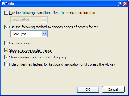
Cleartype is really amazing. I wish you could turn it off for certain fonts, but it really looks nice. You do need to use the Cleartype tuning page to get decent performance -- before running that it was being too "blurry" and color fringing was pretty bad. But afterwards, gosh it's nice.
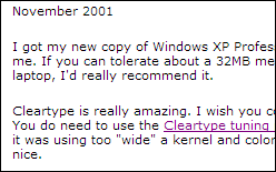
Screenshot of ClearType from my Dell Inspiron (might look good on your LCD or it might look bad.)
I still can't use the new Start menu. I'm just not interested in an interface that reconfigures itself...mostly I do the same tasks and I want them in exactly the same arrangement every time. Also, I rely heavily on keyboard shortcuts, and it's much harder to use them with it.
Microsoft finally fixed the task bar, so I don't have to use bumper to fix the 3 pixels below it anymore. ctrl-alt-del pops up the task-list directly, really nice.
The multiple user switching is amazing -- on my laptop, I can have somebody over to work and they just login to source control right alongside, without losing all my work.
Visual Bugs
I'm picky about these things -- overall the visual details are quite nice. I especially notice the subtle shadowing on the scrollbars and stuff like that. The scrollbars are pure brilliance, honestly one of the parts that really shines over and above OS X.
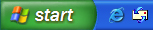
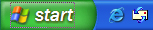
But some of the polish isn't quite there. For instance, the new start button:
 ,
,
which looks alright (albeit way too green for readability),
until you click it, when it gets a Windows 3.0-era focus rectangle (notice the stippled line, it's so 1990 chic):
 .
.
Same thing with a normal dialog:
 .
.
I really wish they could have brought the visual style up to this level of the implementation as well.
Internet Explorer has a few resource bugs as well. The icons are cropped a little bit, so somebody was
sloppy with cutting this stuff out (notice the square-ish edge on the right side of what should be a round button):

I'm using the small icons because the big ones are too loud and distracting. I wish they had a less-saturated mode again.
Saturation
I'm using the BLUE scheme because everything else is somehow even more visually distracting (at least blue is something of
a background color.) But it's interesting to do a little color sampling in Photoshop:
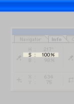
That means the blue artwork in the system is 100% saturated. Saturation usually means "distracting" -- so the point of this
OS is that the Window borders overtake the content inside them.
I find it really weird that people compare OS X and Windows XP so much. For instance, I think OS X's JPEG viewer is one of the most beautiful things ever, just a titlebar (white so no color distortion) with wonderful CONTENT inside it and a subtle drop-shadow. Apple built something that has loud glassy buttons, but the basic visual design is still pretty refined. That same screenshot has a blue background, but it's not the same, really.
In contrast, Microsoft made the window borders thicker, made the titlebar thicker, and made the visual design overtake the UI. They may not realize it, but the OS should be playing a supporting role, not the lead one. They of course probably think the opposite. "Oh look, I'm opening windows and menus!"
Drop Shadows
Microsoft's implementation, frankly, sucks. They use a silly tiny box filter instead of a reasonable Gaussian, computing shadows slows down the OS by about a factor of three. And the implementation has bugs.
Let's just look:
Turning on the shadows...
But if we turn on the "transition effect" up above it cancels out the shadow! Small windows get no shadows (but a transition), and big windows get shadows. I don't think that makes sense. Once the transition ends, it's very weird to have some windows with a shadow and some not.
The actual conclusion is that because they're so slow, I leave the shadows off all the time.
I've also changed the font in the titlebar to 8-point, which the huge titlebars smaller and less overwhelming.
Resource Hacking
Turns out, all the UI in Win XP is hidden in a DLL (or rather several). If you have MS Visual Studio or some other resource editor, you can do "Open As Resources" and then save & load your own.
I dig around in C:\WINNT\Resources\Themes and notice:
C:\WINNT\Resources\Themes\Luna\Luna.msstyles
C:\WINNT\Resources\Themes\Luna\Shell\NormalColor\shellstyle.dll
Both of these can be opened in VC's resource editor, which is just really cool:
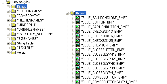
All the images are BMPs, I think some may be 32-bit. They also have a bunch of layout code in there that looks editable to me.
I wish they actually had opened this technology with a supported interface, but it's nice to see that someone did the work to make a configurable UI. Apparently, Stardock has a license to do a resource editor for XP -- I hope they use just the native stuff and don't try to add their own code on top (from their past work, it seems like they like building slow stuff on top of Windows.)
Unfortunately, Microsoft doesn't seem to have such simple operators as serious runtime tinting or compositing, so the different "color" modes in Win XP are actually all separate artwork, several hundred files each! It would be much cooler if you could just replace a gradient and a few color values and desaturate the UI. In addition to three provided color styles (one blue, one green, one silver), there's one commented out, called "Champagne." But the artwork's all gone.
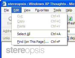
Task-oriented UI
I think the task-oriented stuff is a nice usability advance for novice users, but it's really not optimized for advanced users. For instance, if you're in a folder and you hit "Ctrl-F", which used to let you start a file search by typing a name right away, in XP you get this:
I've disabled the paperclip-like dog, which usually asks to help you (and then pouts when you tell him to go away.)
You have to "change options" and change to "Advanced Mode" to get the normal "type a name and we'll find it" interface.
The one notable thing about this new interface is that it requires little artist time -- it's all 100% text! But whither the icon?
Now, numerable studies have shown that people recognize colors and icons faster than they do text they have to read, but Microsoft has stuck with this particular single-color "arrow-icon" thing, I think to their detriment. If you use a mouse, the icons are just a little too small to hit really quickly (it takes "precision" mousing rather than quick clicking.) Finally, the hotkeys are super-hidden using the little underlines they like so much. It would have served them well to even turn the arrows into colored keyboard keys that you could push to do the action, or icons, or something else.
Conclusions
This OS is growing on me, mostly because of ClearType. But Microsoft doesn't realize their supporting role, that people go to the computer for reasons other than the color of the packaging.
If your television were bright RED and had flashing lights all around it, you'd never be able to watch a good movie on it. Same thing here. It's a role and maturity issue, and maybe they'll get it someday. I'd much rather they helped people make really great documents in Office or produce really flashy video, or mix really great audio, or see really spectacular websites.
I'm still wanting a super-desaturated UI (even the silver scheme has way too much shininess), with some subtlety. But at least the technology direction is a decent one.
Sree told me once that when you first realize you can do shiny specular buttons on a computer, you do it for a while, because it's so cool that the technology lets you make these crazy shiny BRIGHT things. And it's only after you've let the technology grow for awhile that you realize that you can do subtle things that are more oriented to subtlety and good information design, more human colors, less distracting motion, that sort of thing. It's not about showing off as much as it is creating an ambient environment where people like to be.
It's not that 24-bit color or alpha-blending or any of these things have to result in gaudy UI, it's just that they let you make gaudy UI, so you do it that way for the first few years. Novelty, variety, whatever. I guess we'll wait until Windows 2009, and maybe we'll get something tasteful too?